Build a Mac app shell
Use Codex to build a Mac-native SwiftUI app shell with a sidebar, detail pane, inspector, commands, and Settings.
Summary
Use Codex and the Build macOS Apps plugin to turn an app idea into a desktop-native NavigationSplitView app, keep sidebar selection stable, add menus, toolbars, and keyboard shortcuts, and move preferences into a dedicated Settings scene.
Best for
- New Mac app ideas or iPad-first and web-first concepts that need a real desktop shell with persistent navigation, menus, toolbars, and keyboard shortcuts
- Editor, library, admin, or review tools where a sidebar selection drives a detail pane and an inspector exposes secondary metadata or actions
- Mac apps where settings should live in a dedicated preferences window instead of another pushed screen in the main content stack
Useful plugins and skills
- build-macos-apps: Use the macOS SwiftUI patterns, window management, AppKit interop, and build/run skills to create sidebar-detail-inspector layouts, wire menus and settings, and validate the app in a shell-first loop.
Starter prompt
Build a Mac-Native Sidebar and Inspector Shell
Use the Build macOS Apps plugin to turn [describe your app idea] into a Mac-native SwiftUI app shell with a sidebar, detail pane, inspector, commands, and Settings.
Constraints:
- Choose the scene model first. Prefer `WindowGroup` for the main window and add a dedicated `Settings` scene for preferences.
- Build the main UI around `NavigationSplitView` with explicit selection state, a native `.sidebar` list, a detail surface, and an `inspector(isPresented:)` panel for secondary metadata or controls.
- Keep sidebar rows lightweight and native: one icon, one title line, and at most one short secondary line. Do not wrap every row in large custom cards unless there is a strong product reason.
- Expose important actions through scene-level `commands`, `CommandMenu`, toolbar buttons, and keyboard shortcuts. Do not hide the only path to a critical action behind gestures.
- Use `@SceneStorage` for window-scoped UI state, `@AppStorage` for preferences, and explicit parent-owned selection bindings for sidebar/detail coordination.
- Prefer system materials, semantic colors, and standard sidebar backgrounds. Add custom styling only to detail or inspector content cards when needed.
- Use a narrow AppKit bridge only if SwiftUI cannot express one specific desktop behavior cleanly.
- Create or update `script/build_and_run.sh`, run the smallest useful build/run check, and tell me the exact commands you used.
Deliver:
- the scene structure and main sidebar/detail/inspector views
- the menu, toolbar, and keyboard shortcut wiring
- the Settings scene and preference state model
- any AppKit bridge you added and why it was necessary
- the build/run validation steps and any desktop UX follow-up you recommend
Related links
Start from the Mac scene model
This use case is for turning an app idea into a Mac app shell that feels built for desktop, not stretched from a touch-first stack. Ask Codex to choose the scene model first, then design the main window around stable sidebar selection, a detail surface, and an inspector for secondary controls or metadata.
Use the Build macOS Apps plugin when you want Codex to apply that desktop structure and keep the build/run loop shell-first. Its macOS SwiftUI patterns skill is a good fit for scene design, sidebars, inspectors, commands, settings, and small AppKit bridges when SwiftUI stops just short of one Mac-specific behavior.
Build a sidebar, detail pane, and inspector
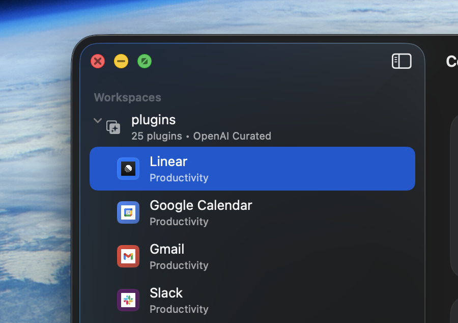
Prefer NavigationSplitView when the feature benefits from persistent navigation and a stable selected item. Keep sidebar rows native and lightweight, let the sidebar use system backgrounds, and reserve custom cards or dense metadata for the detail pane or inspector.
struct LibraryRootView: View {
  @SceneStorage("LibraryRootView.selection") private var selection: Item.ID?
  @SceneStorage("LibraryRootView.showInspector") private var showInspector = true

  var body: some View {
    NavigationSplitView {
      List(selection: $selection) {
        ForEach(items) { item in
          Label(item.title, systemImage: item.systemImage)
            .tag(item.id)
        }
      }
      .listStyle(.sidebar)
      .navigationTitle("Library")
    } detail: {
      ItemDetailView(selection: selection)
        .inspector(isPresented: $showInspector) {
          ItemInspectorView(selection: selection)
        }
    }
  }
}
If the app needs unusual split sizing, low-level window coordination, or custom responder-chain behavior, ask Codex to keep the SwiftUI shell intact and add only the smallest AppKit bridge required for that one gap.
Put commands, toolbars, and shortcuts in the desktop layer
Mac users should be able to discover important actions in the menu bar, the toolbar, and keyboard shortcuts. Ask Codex to wire scene-level commands, context-sensitive menu items, and toolbar buttons around the same app actions so desktop users do not have to hunt for gesture-only controls.
@main
struct LibraryApp: App {
  var body: some Scene {
    WindowGroup {
      LibraryRootView()
    }
    .commands {
      CommandMenu("Library") {
        Button("New Item") {
          // Create a new item.
        }
        .keyboardShortcut("n")

        Button("Toggle Inspector") {
          // Route this command to the focused window or selected item state.
        }
        .keyboardShortcut("i", modifiers: [.command, .option])
      }
    }

    Settings {
      LibrarySettingsView()
    }
  }
}
Use FocusedValue, scene state, or explicit selection state when a command should apply to the current detail item. If a shortcut would be registered in multiple places, ask Codex to consolidate ownership so the app has one clear command route.
Keep preferences in Settings
For app preferences, use a dedicated Settings scene and persist durable user choices with @AppStorage. This is usually a better Mac fit than pushing a settings screen inside the main content window.
struct LibrarySettingsView: View {
  @AppStorage("showItemMetadata") private var showItemMetadata = true

  var body: some View {
    TabView {
      Form {
        Toggle("Show Item Metadata", isOn: $showItemMetadata)
      }
      .tabItem { Label("General", systemImage: "gearshape") }
    }
    .frame(width: 460, height: 260)
    .scenePadding()
  }
}
Prompt the app concept, then validate the shell
This page works best when your prompt names the app concept, the main content objects, and the primary actions, then asks Codex to build the desktop shell around that workflow first. Have the agent run a small build/run check and summarize the scene structure, command wiring, state ownership, and any AppKit edge it had to bridge.
Practical tips
Keep the sidebar native
Use one icon, one title line, and at most one short secondary line in sidebar rows. Move richer cards, counters, and metadata into the detail pane or inspector so the source list stays easy to scan.
Avoid hiding settings in the main stack
If a user preference affects the whole app, ask Codex to put that control in Settings with @AppStorage and expose an entry point through the app menu instead of building another pushed settings screen.
Save AppKit for narrow desktop gaps
If the feature needs open/save panels, first-responder control, or a custom NSView, use AppKit as a small edge around a SwiftUI-owned state model rather than rewriting the whole window in AppKit.